Navigation menu
Sacred items
CANON SAMMON’S INTRODUCTION TO THE SACRED ITEMS IN OUR LADY OF LOURDES CHURCH
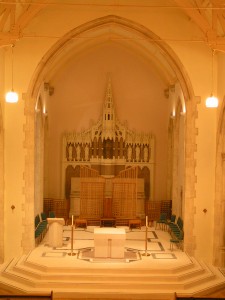
As a community I am sure you will all join me in giving praise and thanks to the most Holy Trinity, Father Son and Holy Spirit and Our Blessed Lady of Lourdes for the successful re-ordering of the Church sanctuary. All for the greater honour and glory of God. I was most edified and grateful for the many positive comments on the re-ordering and am so pleased that parishioners find it spiritually uplifting, prayerful, peaceful and aesthetically beautiful. In order to help parishioners to understand the meaning of the various items I give below a brief explanation of them, so you will see the thinking behind the symbol itself.
The whole ensemble – when viewed must be seen as a whole picture. It raises our minds to heavenly things, the glory of God, the Transcendent, the Beyond, the Cosmos, the mystery of the Eucharist. Father Patrick J Sammon Parish Priest
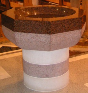
The font weighs over 1¼ tons. The bowl of the font is made from Balmoral red granite (also known as Aberdeen red). In fact it is a Finnish stone first introduced to the British Isles as ballast on ships carrying timber cargoes. It is a dense adamantine stone and much care needs to be taken when forming the geometric shapes to avoid plucking the stone and leaving a hole on the surface. The bowl is polished with care and attention to retain the trueness of the inverted semi-circle.
The underside is hand chiselled to contrast with the polished surface and shows the octagon of the top reducing to meet the circle of the three stone supporting drum. The centre-drum of the stone is chiselled in Balmoral red and the other two are made of best-bed Portland stone. The surface is double tracked, a heavier type of chiselling. This enlivens the otherwise dull flat look of a plain rubbed finish.
The Wanstead Baptistry expresses the symbolism of Baptism in the most effective way available to it. Firstly, it is located at the entrance to the nave of the Church. This has a particular significance in relation to baptism as it symbolises the first step in the ‘entrance’ or initiation into the people of God. As much space as possible is created around the font, and the beautiful marble floor lays emphasis on the sacral area. This is spacious enough to accommodate with ease the priest or deacon, the candidates, families, godparents and others who may be involved – friends, neighbours and members of the local church.
The font draws its inspiration from the rich symbolism associated with the waters of baptism. From slavery to freedom, from blindness to vision, from death to life. The huge red granite bowl is ‘both tomb and womb’ large enough to immerse an infant (baptism by immersion) or by pouring the water on the candidate’s head over the font (baptism by infusion).
Finally, geometric shapes also contain hidden symbolism. The octagonal bowl points to the eighth day, the day after the Sabbath, the day of resurrection. A circular tub form recalling a well supports the octagon. The cross shaped design in the floor is the resting place of the font, and the whole surrounded by a square tomb shape proclaiming triumph over death.
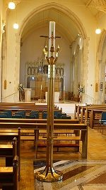 THE PASCHAL CANDLE makes a statement about Jesus being the light of the world. It is placed beside the Baptism font and contains the great Easter Candle (Lumen Christi). The symbolic flames on the candleholder remind us of the Holy Spirit coming to us in Baptism and Confirmation.
It is here that the Paschal Candle will be placed on Holy Saturday night and the Exsultet proclaimed.
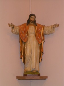 THE STATUE OF THE SACRED HEART OF JESUS
The statue of the Sacred Heart of Jesus which has been in the Church for many years is now placed in the best position I could find for it. It encourages devotion to the Sacred Heart. A devotion which is very strong in our parish and which I wholeheartedly endorse. People may light candles near the statue and say the prayer
“Sacred Heart of Jesus, I place my trust in Thee.”
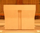 ALTAR
ALTAR
The altar, weighs 3 tons and is carved from a single block of Portland stone, is the primary focal point of the Church. The altar is both table and sacrificial stone, and is also seen as a symbol of Christ. The most dominant symbol in the sanctuary, the focal point is the altar, the table of the Eucharist, where Mass is celebrated and the bread and wine become the Body and Blood of Christ. The Bishop blessed the altar and anointed it with sacred chrism, for that reason it is compared to a person, something sacred and special. The altar also contains the relics of Saint Ruffina and Saint Clement, martyrs; these relics were taken from the old altar. The altar stands alone, and makes a strong liturgical statement – the table of the Eucharist, Christ Himself!
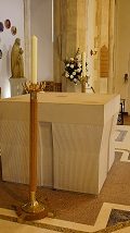 THE TWO CANDLE STANDS ON THE ALTAR
The two candle stands on the altar match the Paschal Candle stand in design and contain the candles used for the celebration of Mass.
This is where the priest presides at the Eucharist. He presides over the people of God gathered for the celebration. This chair is simply designed and is made in oak wood.
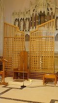
Chancel Screen is the correct title for the screen. It is not a trellis, or a gate or any other such thing. Chancel screens have a long history in the Church, going back to the 11th and 12th centuries, having different functions reflecting the changes in liturgy. The new oak screen in our church is both functional and symbolic. Firstly, it serves as a backdrop to the sanctuary, defining the liturgical area, and shielding the former programme of the stone reredos. Hence the prominence and pre-eminence of the new stone altar is ensured.
Symbolically, the new screen has many layers of meaning – veil of the temple, Body of Christ, hovering spirit and gateway to heaven. In terms of architecture, the screen is used to create the space of the new sanctuary, terminating but not stopping the axis from baptismal font through the altar.
The white Portuguese limestone floor suggests a link between the spiritual and space. Polished coloured marbles and needlepurch red granite locate and unite the three main foci of the sanctuary, i.e. the altar, the ambo and the Celebrants chair. The floor gives meaning and oneness. Light is reflected from the white plane of the stone, giving a feeling of luminous transparency to the whole sanctuary.
This is a chapel for private prayer and adoration, where the Blessed Sacrament is reserved in the tabernacle. It is decorated in an aesthetically pleasing colour with two stained glass windows of abstract design, illustrating the glory, beauty and mystery of God.
TABERNACLE
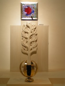
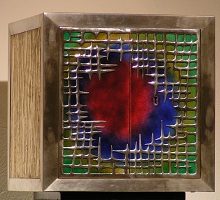 The symbolism of the decoration on the tabernacle:
The silver mesh on the doors represent Calvary. The many crosses being the continuation of the sacrifice of Christ at every Mass. The enamel behind the crosses represents the cosmos from which all things were created by God. The colours chosen were to compliment the icon mounted above the tabernacle. The red colour in the centre of the enamel also represents the wine (blood of Christ). The gold side panels are etched to look like wood grain and represent the tree of life – echoing the carved tree of life on the pedestal. The gold panels pick up the gold of the Icon of the Trinity.
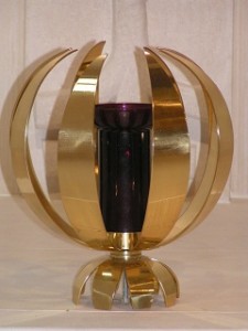
The lamp in the Blessed Sacrament chapel remains lit day and night, reminding us of the Real Presence of Jesus in the tabernacle. The lamp in our chapel is made in the shape of a globe encircling the light reminding us that Jesus is the light of the world and is really, truly and substantially present in the Eucharist.
In what sense is such a new work an icon?
It is a meditation on the subject, beginning from the traditional icon as a starting point – very much in the spirit of Sir John Taverner’s musical works, such as ‘Icon of St Seraphim’ and ‘The Protecting Veil’ Sister Petra Clare also makes traditional icons, and has a great reverence for the tradition. How was this icon developed? The icon began among a small group of people interested in the interchange between theology and science. In studying and meditating on the Holy Trinity, we were interested in how God the Trinity created the universe, so the theme was the three persons of the Trinity of whom one – the Word – becomes flesh. The icon therefore begins at the top with the path of cosmic particles – the first material sign of God’s creating Word making the material world, and develops through the theme of God ‘clothing the world as with a garment’ – using photographs of the earth seen from space as inspiration for the garments of the three persons, and ending with greatly magnified microchips – the result of man working in the world.
The Biblical text
The Biblical text linked from the early years of the Church with the Trinity, and from which Rublev’s famous icon is derived, is the Old Testament description of the meeting with Abraham and Sarah:-
“And the Lord appeared to him by the oaks of Mamre – he lifted up his eyes and looked, and behold, three men stood in front of him. When he saw them, he ran from the tent door to meet them, and bowed down to the earth, and said, “My Lord, if I have found favour in your sight, do not pass by your servant….rest yourselves under the tree…..he took curds and milk
and the calf which he had prepared, and set it before them.” Genesis 18 vi-8
This is interpreted as a manifestation of the Trinity by St Augustine and others, primarily, because the three are collectively addressed by the name reserved for God, and various miraculous events in the visit.
The design of the icon
The icon reads from the top ‘heaven’ to bottom ‘earth.’ The top semi-circle is based on the tracks made by nuclear particles in a bubble chamber. It also has, above each of the three figures a crystal lattice – which looks like a thumb print – and is the nearest thing to a photo of an atom. It reminds us that creation is made by the hand of God.
Instead of drawing wings and halos, to represent heavenly power, the artist has used wing and halo like designs drawn from ‘close-ups’ of the stars, taken by the Hubble telescope.
The ‘wings’ from left to right are aspects of the Eagle nebula (M16), the Egg nebula (CRL2688) and the Starburst galaxy(NGC253). The stars which evoke halos are, from left to right the Cat’s eye nebula (NGC 6543), the Hourglass nebula (MyCn18) and the Spiral Galaxy (M100) in the Virgo cluster. These are chosen for visual qualities which form a meditation on the qualities of the three persons of the Trinity.
The icon depicts three persons in the order of the Creed: from left to right ‘I believe in the Father, the Son and the Holy Spirit’.
Of course we cannot really draw a picture of the three-who-are-one, anymore than we can work out scientifically the entire process of creation. The three beings, like mathematical symbols, are a sign of something greater and more real – drawing a picture hides the mystery as much as it displays it. However, a picture can draw our attention to the mystery and encourage us to explore further. The most obvious sign in the heavens’ is in the stars showing the ‘wings’ and halo of the centre figure. The Hourglass nebula is a double circle, or figure of eight, while the Egg nebula has two radiating blue wings. The ‘double’ nature of these stars is used as sign of the two natures of Christ – somehow God and man, heaven and earth come together – the symbol is a marker to introduce us to the wonder – how can this be? The colours on the left suggest the origin of life – depth of colour in the magenta of the Cat’s eye spiral and the soft ‘towers’ of the Eagle nebula: in the traditional icon the figure representing the father often has a house behind him – “In my Father’s house there are many mansions.’ The silver (actually white gold) tones on the right suggest the ‘wings of a dove, covered with gold and silver’ and the appearance of the Holy Spirit above the water. The Holy Spirit breathes on the waters and animates creation.
The next layer down is the level of the created world and the appearance of human life. The clothes of the three are based on photographs of the earth from the Landsat satellite. Their style of dress is based on the passage from the Bible – they wear the clothes of a desert dweller – the turbans and robes of the tribes among whom Abraham dwelt. The red-gold waves of the ‘Father’s’ garments are based on the wave form of dunes in the African Namib desert – they also remind us that the children of Israel got to know God in the desert. His headgear is based on the mineral rich area around the Khan river where uranium deposits are found. The silver sheen’s of the ‘Spirit’s’ garments are based on the T’ien Shan – the Celestial mountains – on the silk road linking east and west. The central figure representing the ‘Son’ reflects Incarnation and the counterpoint of two natures, again. The shirt is a view of the New York suburbs from space, reminding us of Christ’s mission in busy : yet this is covered by a cloak of the oghurd (star) dunes of the Libyan Sahara, with a head covering formed from the seif dunes of the Arabian region of the Sahara. They all hold staffs. At their simplest, these are travellers staffs, but staffs have always been decorated and developed in various cultures as a sign of spiritual power, such as our own Bishop’s crook. The two figures on the outside who represent the unborn heavenly persons of the Trinity, simply have a suggestion of rays coming from heaven into their hands, but the central figure has a staff based on computer generated images of DNA – the building blocks of the human body – spiralling into a staff.
The centre of the composition is a table – the holy table. It is gold and shiny, reminding us that the ark of the covenant was gilded entire, and we still gild the inside of the tabernacle and the chalice as a sign of the holy. On the table are simply bread and wine in a chalice. In early icons of the three visitors to Abraham and his wife, the table is often set for a full feast. The monk saint Andrew Rublev, however, reduced this to the simplest sign possible of the eucharist – the calf’s head in a chalice, sign of the sacrifice of the Mass. This icon simply shows the bread and wine, the elements of the Mass. The artist has also drawn something else not regularly done in the icon – drawn the table in ‘real time’ perspective. Normally in the icon physical objects are drawn in reverse perspective – so that perspective opens out into an unknown world inside the icon, simultaneously making the experience more intimate, the people closer and inviting you in. This is what has been done in the chairs and footstools, so that there is a paradox between the reversed perspective on the footstools – which shows you the persons of the Trinity do not belong to this world, and the ‘real time’ perspective springing out from the Lord in the centre which shows the incarnation – Christ became man and lived in real time. Finally the icon has written on the table E=mc2, the formula Einstein discovered – energy =mass(m) light (c) squared. A group of us, among whom were scientists, decided that the nearest we could get in mathematical terms to a sign of the Trinity acting in creation was this, so consequently we thought of it as Einstein’s discovery of a ‘Word’ of God.
The stools are shown as the product of human skills – suggestive of the way computer ‘virtual reality’ images are developed on a grid. At ground level the floor and foot-stool designs are based on magnified computer chips.
In this way we show an ‘icon’ of heaven coming to earth, showing us the image of the Trinity through the praise of all creation.
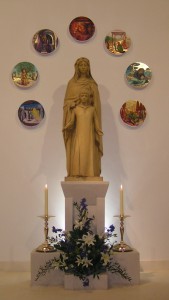
The Lady Chapel is reserved for devotion to the Mother of God and contains the statue of Our Blessed Lady commissioned about 25 years ago for this parish. It is placed on a plinth of Portland stone and is encircled by 7 paintings depicting Biblical scenes pertaining to Our Blessed Lady. The intention is to create a prayerful space to raise our minds to heavenly things and to remind us that the Mother of God walked this earth and was involved in the everyday life of her community and that when she died she was assumed body and soul into heaven.
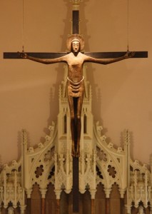 THE CRUCIFIX
– The crucifix in our church is a figure of the crucified Christ on the cross. He is clothed only in a simple loin cloth and his long arms, legs and feet call forth our compassion and convey something of the human suffering and helplessness of Jesus. Yet the dignified, haloed head expresses a nobility that portrays a Christ more of triumph than of pity. He has conquered death and is Risen. The artist, Dr Imogen Stuart, herself says: “My Christ is cruciform. Christ is the Cross – symbol of salvation.
Saviour of people – embracing all humanity. He is the Resurrection after suffering. The elongated body gives the figure an upsurging movement. The face acts as God’s mystery and his revelation through Christ.” The cross also portrays a sorrow and pain at the heart of things. The Resurrection is suggested in a slight incline upwards of the palms of the hands which convey something of the expression on the face. An innate quality of beauty, peace and permanence is there. The figure cast in bronze by the wax method is a technique that reaches back to very ancient civilizations. The cross is at once revealing and concealing, inviting contemplation, of wonder, awe, sadness, mystery, hope and resurrection. It has to be ‘contemplated’, ‘gazed upon’ – it calls us to prayer, beckons us to come to Him. Jesus is looking out over us, his eyes fixed upon us (the gaze of Christ) and thus sees through us and invites us to “Come to me all who are weary and over burdened and I will give you rest”.
The cross is suspended on two steel wires specially designed to carry four times its weight and they are secured in the roof of the church to a bridge-like timber structure. May the cross specially commissioned for Our Lady of Lourdes community, call us to prayer and to meditation on the Passion, Death and Resurrection of Our Lord, Jesus Christ.
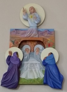
The Fifteenth Station – The Resurrection
The new station was unveiled at the Easter Vigil 2016 by Pippa Watson, Daughter of the present Chair of The Parish Pastoral Council.
